Brand identity · 7 Hoa Tay
7 Hoa Tay
A visual identity and stationery system for a screenwriting company.
Client 7 Hoa Tay
Sector Screenwriting
Scope Identity · Stationery
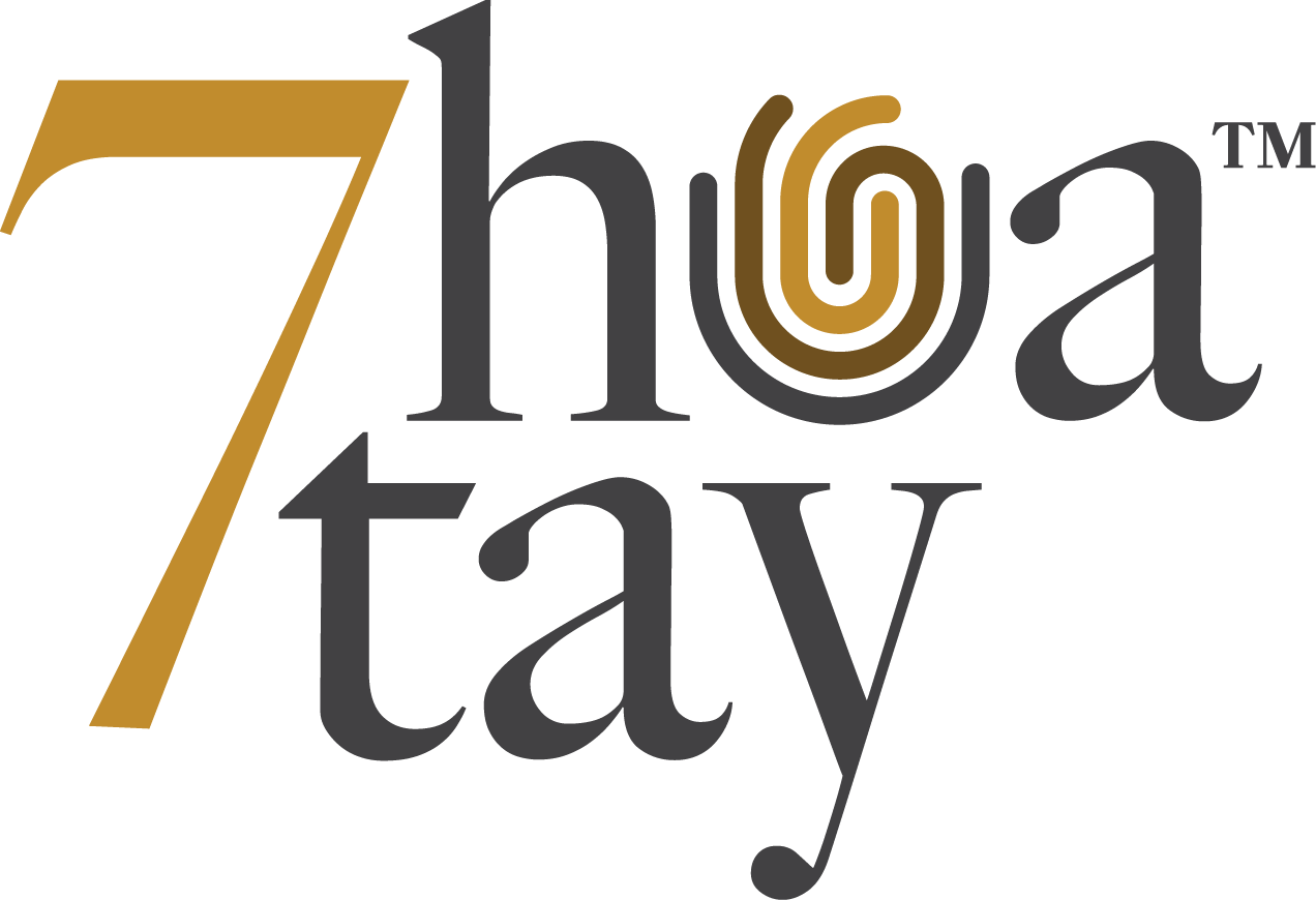
The 7 Hoa Tay mark brings the numeral into the name, with a circular line detail set inside the lettering. Gold, deep brown and charcoal give the identity a compact palette.
A graphic made from seven lines extends the mark across printed materials. Its weight and position change with the format, while the logo and typography remain consistent.
The identity system
The brand guidelines specify logo versions for light and dark grounds, a three-colour palette and the seven-line graphic.
Applications / 01—04
Stationery in use
Four printed formats show how the mark, palette and line graphic work at different scales.
Business cards
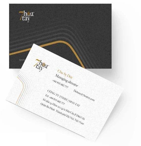
One side uses a charcoal field, the logo and the seven-line graphic. The reverse keeps contact information on white, with the graphic reduced to a quiet corner detail.
Letterheads
The letterhead leaves the page open for correspondence. The logo and contact details sit at the top; the gold and grey lines return along the lower edge.
Presentation folders
The dark folder carries a small mark on the exterior. Inside, a matching document pocket and printed sheet bring the stationery elements together.
Envelopes
White correspondence envelopes and a charcoal document envelope use the same mark, restrained type and gold linework. The source system includes A4, A5 and A6 formats.
Identity and stationery shown using the original 7 Hoa Tay artwork.
View all work