Brand Strategy & Identity
VISRating Branding
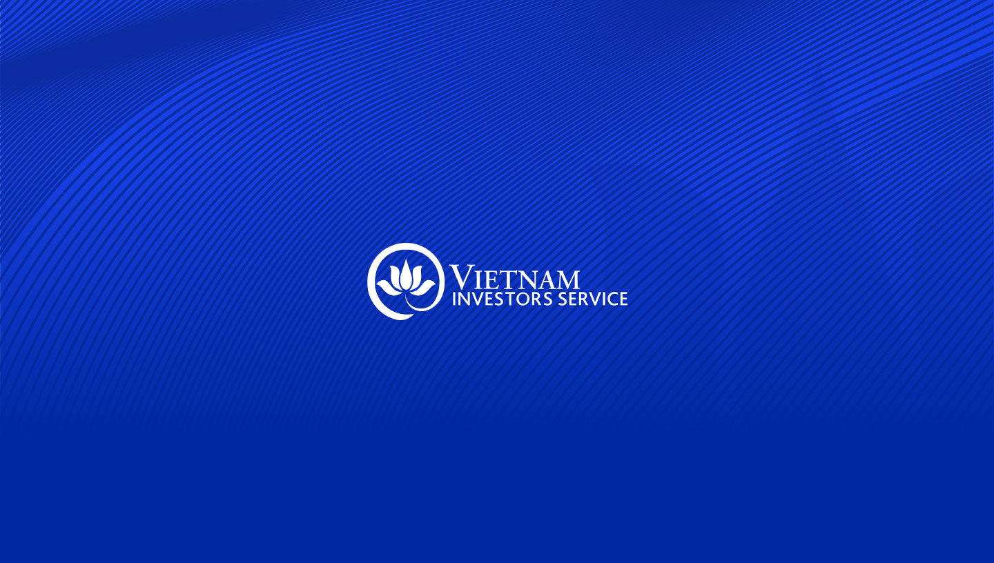
A meticulously crafted brand identity for VISRating that balances Vietnamese heritage—symbolized by a geometric lotus—with the authoritative, stable design language of a top-tier rating agency.
- —Brand Strategy & Identity
- —Digital Design & Experience
- —Web & App Development
VISRating’s work process involves meticulous attention to detail, led by Mr. Simon, the Director of VIS Rating (at that time), known for his meticulous nature. To ensure a comprehensive exploration of logo options, we presented no less than 15 initial logo designs and their various iterations. Initially, we considered numerous symbols representing Vietnam, such as bamboo, buildings, and conical hats. However, the lotus flower emerged as the distinguished choice to represent VISRating.
The lotus design features a solid core originating from the calyx, forming a circular shape that represents strength and stability. The brand’s iconic blue color, inspired by Moody’s brand identity, instills a sense of professionalism. The accompanying font embodies reliability and steadfastness. Collectively, these elements have shaped an overall logo that has received approval and high praise from VISRating.
This thorough process demonstrates our commitment to finding the perfect visual representation for VISRating. We understand the significance of a logo in portraying the brand’s essence and fostering trust among stakeholders. By combining careful analysis, design expertise, and client feedback, we have successfully crafted a logo that captures the essence of VISRating and aligns with its vision.
Our team at VISRating remains dedicated to delivering outstanding results, paying attention to every detail to ensure that our clients receive the highest quality of work. With our expertise and collaborative approach, we strive to provide branding solutions that resonate with our clients’ goals and aspirations.
We are excited to continue our journey with VISRating, leveraging our creative abilities and technical knowledge to support their vision of transforming brand recognition in Vietnam.
The challenge
- —VISRating required a brand identity that could portray its core essence and foster deep trust among stakeholders. Guided by a highly meticulous leadership team, the project demanded a rigorous exploration of visual concepts.
- —The challenge was to discover a unique visual representation that authentically symbolized Vietnam, while simultaneously upholding the authoritative and professional standards expected of a top-tier rating agency.
Our approach
- —We adopted a highly iterative and collaborative process, presenting over 15 initial logo concepts. After exploring traditional symbols like bamboo and conical hats, we strategically selected the lotus flower as the perfect emblem for the brand.
- —We crafted a solid, circular lotus design originating from the calyx to represent stability. This was paired with a steadfast font and a signature blue inspired by Moody’s brand identity to instill a profound sense of reliability.
Results
- —Executive approval & high praise: Successfully navigated a rigorous review process to win full approval from VISRating’s meticulous leadership.
- —Symbol of strength & stability: Delivered a cohesive visual identity that perfectly captures the brand's essence and long-term vision.
- —Elevated brand authority: Fostered stakeholder trust through a professional design language that echoes international financial standards.
- —Transformed brand recognition: Established a strong, recognizable foundation to support VISRating’s mission of transforming the market in Vietnam.